
 For this assignment we had to make a logo out of a real photo. The photo had to connect to you in some way. So for my logo I chose a chicken. Why did I choose a chicken? Well my blog name (noodle doodle doo) which is a pun on cockadoodledoo. which is the famous sound a rooster makes. since a rooster is a male version of a chicken I choose a chicken to put a my logo because it just makes sense with my name.
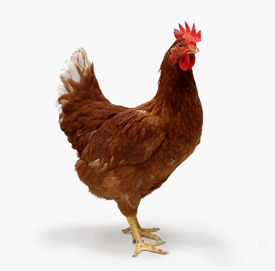
 this is the original photo

The outlines are all different sizes to put emphasis on some areas more than others and to make it look better because some areas looked good with a certain line size but other areas didn't look good with the same line size.
As for the colors of this one I tried to make it as close to the original colors as possible. I think this was my favorite color scheme out of the others I tried because like the more realistic qualities to balance out the cartoon features.I also think it's more visually good to look at then the other ones I tried and they just felt natural and putting funny colors wouldn't help it
These were the other color schemes I played with. Even though I didn't
like these one as much as I did my final one, some of them still turned
out pretty good but not really what i was looking for and since I wanted to one to use one as my blog logo these didn't really fit in with my blog. Still nice to see the variables and how good or bad it looks in each color.


I learned a lot of tips and trick on illustrator and how to fix some problems that I encountered. For my very first thing made with illustrator I'm proud of it and I am now a little more confident with using illustrator. This assignment was stressful but fun to see the result and i can't wait for another adventure in illustrator.
No comments:
Post a Comment