
Tuesday 9 February 2016
Wednesday 21 January 2015
Culminating Project

Lucky for me I already had an idea for my shots and such in my head and went straight at it. It mostly stayed how i visioned it but it did changed a little bit and had to be improved. The exact places of the background people and the main persons pose where all improved. So after about 4 shots of trying to take the best fluke shit I finally got a really good one that i thought would work and went to the next process.
In editing I just went with the feelings I have felt all my life onto the page using all the techniques I have taught my self. Most of the editing is very little touches that make the art that much better. I will go through most of the things I did. first I blurred the background from the main subject, made a mask of the water that was shaped has his body, played with the text a lot to make it look like a tornado (which took forever), changed the levels of the photo and the last thing I Did was add shadows. most of the shadows are custom made by me!
I am actually proud of this project and is probably my favourite thing that i have done so far. I think that I gave the subject the quality it deserves. Struggling with anxiety also makes me more into the subject matter than anything i have done before.
This Is probably one of my last posts for while so I well post when Im back
there will be a lot better content soon!
- Noodle Doodle Doo
Tuesday 20 January 2015
Friday 9 January 2015
Tuesday 4 November 2014
Garden Photos
In our Cyber ARTS class we just started doing photography. What we had to do is go out and take photos of the garden we have a our school and touch them up later. She didn't tell us much more on how to work things and sent us on our way after we were done we went to look at all the photos we took.When our teacher looked at them she was very surprised that even without teaching us much camera techniques all our photos looked very good. So these are some of my best photos taken


Even though some of these photos look pretty nice I can't wait till I am able to learn how to do more things with photography and make my photos look 100 times better since it's really fun and interesting to do and learn about. Thank you for reading and ill see you in the next post!
This first photo I think is very nice. The focus on the wood leads your eye upward to the main focus of the picture while the background also leads you eye to the main focus because of the tiers. The photo has you looking straight up and down since everything is right on top of each other but still highlights the main focus because it's the brightest most colourful thing there.
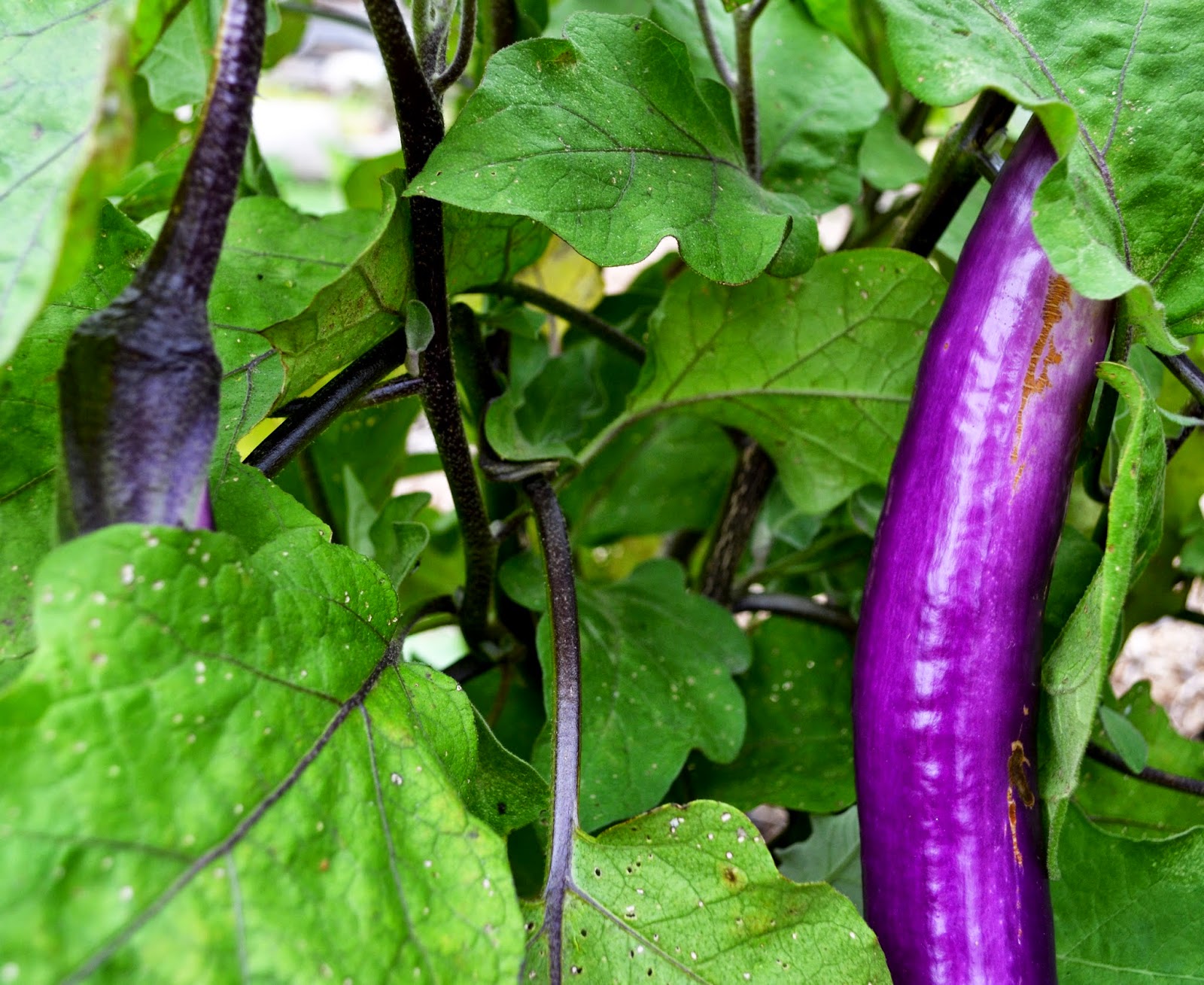
This second photo is nice because it uses the rule of thirds which is really nice on your eyes, It's
also nice because the subject highlight itself because it's the most outstanding colour in the photo. The colour of the eggplant also makes you feel calm so it makes the photo look nicer. The outstanding colour also helped focus more towards the eggplant than the other things.
I like like this photo for a few different reasons. first being the angle. I think the angle really helps this photo and makes it look unique. Which leads me into another thing I like about it. The angle and way the rims are placed leads your eye from the far right to the far left. I also think that it's a nice photo because even though a lot of things are happening in this photo, they blend together so it doesn't look too crowded.
This photo is good for it's colours and focus. the focus is really good in this photo because it highlights the main subject by the background being blurry. While the colours are really good on the eye and helps keep the focus on the main subject which in the case are the flowers. Therefore the focus and colours help each other which makes this photo look nice
This last photo I like for the angle and the way the lighting was. I like the way the angle was because it makes you feel small and it makes the object look bigger. I liked how this affect looked when it came to these trees. The lighting was good on this photo because there was not to much and not to little of light coming from the gaps in the leaves
not to mention that the aperture that I set the camera to highlights the natural light which highlights the tree very nicely
Even though some of these photos look pretty nice I can't wait till I am able to learn how to do more things with photography and make my photos look 100 times better since it's really fun and interesting to do and learn about. Thank you for reading and ill see you in the next post!
Saturday 1 November 2014
Logo Assignment
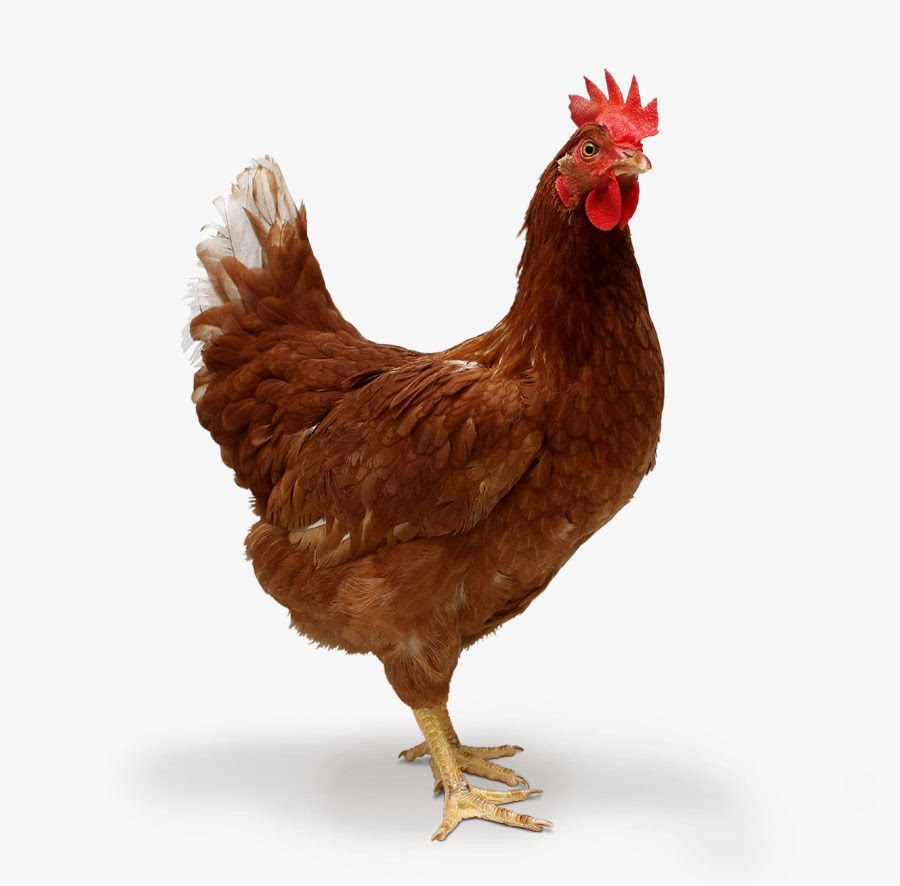 For this assignment we had to make a logo out of a real photo. The photo had to connect to you in some way. So for my logo I chose a chicken. Why did I choose a chicken? Well my blog name (noodle doodle doo) which is a pun on cockadoodledoo. which is the famous sound a rooster makes. since a rooster is a male version of a chicken I choose a chicken to put a my logo because it just makes sense with my name.
 this is the original photo

The outlines are all different sizes to put emphasis on some areas more than others and to make it look better because some areas looked good with a certain line size but other areas didn't look good with the same line size.
As for the colors of this one I tried to make it as close to the original colors as possible. I think this was my favorite color scheme out of the others I tried because like the more realistic qualities to balance out the cartoon features.I also think it's more visually good to look at then the other ones I tried and they just felt natural and putting funny colors wouldn't help it
These were the other color schemes I played with. Even though I didn't
like these one as much as I did my final one, some of them still turned
out pretty good but not really what i was looking for and since I wanted to one to use one as my blog logo these didn't really fit in with my blog. Still nice to see the variables and how good or bad it looks in each color.


I learned a lot of tips and trick on illustrator and how to fix some problems that I encountered. For my very first thing made with illustrator I'm proud of it and I am now a little more confident with using illustrator. This assignment was stressful but fun to see the result and i can't wait for another adventure in illustrator.
Friday 17 October 2014
Daumier Painting Recreation Assignment
original of third class carriage By Daumier

our version of third class carriage

We had an assignment we had to do a few weeks ago which our teacher said we would be using charcoal to create a picture but she didn't tell us what we were creating. Instead she had squares on the floor every square being part of an image. We picked up a random part of the image and had to draw the small image way bigger with charcoal. she told told us to draw what you see and not what you think see. which means drawing the image line by line very accurately and not drawing a bunny because it looks like it on your square. After all the images where drawn we were told to put it together using a number that was on every square (1-30 for example). After we put it together, still not knowing what the image was, we seen that even though every piece was made by a different person, you can see a resemblance to the original painting.
Even though you can see a resemblance to the original painting in our version it doesn't look as life like as the original. The original has very precise detail in it's contour lines and it's shading putting everything in a a specific place to make it look real. while ours it not as detailed because there isn't a lot of accuracy making it look abstract and everywhere instead of controlled and specific like a realistic painting. Also, since 19 people were working on this at once it has multiple 19 different styles of drawing making it look fake because some of it doesn't go together and stands out.
Our version also doesn't have the unity the original has. In our version the lines don't match up very well and the shading is everywhere and doesn't match up with things that are close to it making things not go together. Some of the things we did fit together but there are things that stand out because like i said before, you can see other peoples styles. Some of it is real looking but then other parts look like a cartoon or a mix of the two. While the real version has unity because all the shading matches up nicely (one value leading in to another nicely making it look like it should be there.) and lines actually match up making it look like it should be there.
Lastly out version doesn't have as much feeling as the real one. Our version is so abstract and strange it doesn't really give a feeling. Instead you are to busy thinking of what it actually is instead of the feeling it gives you. While the real one actually makes you feel something because you don't have to try to figure out what it is. The original as a depressing feeling but homey feel. Even though they are poor on the back of a train the seem fine with it which kind of gives you the feeling that they are happy anyway.
Even though our version of the painting had none of the qualities of the original some parts actually looked like the original which was pretty awesome to see. This assignment was really fun to do and I thank all the people who put effort in it as well. See you next post!
Subscribe to:
Posts (Atom)